The Lineage & Impact Analysis page creates interactive diagrams that visualize the journey of your data — tracing the flow from data connections and databases through tables and fields, all the way to the Tableau workbooks and the Power BI reports that depend on them. It answers two key questions: where does this data come from? and what will break if it changes?
New to these concepts? See our guides on Tableau impact analysis and metadata management for BI teams.
Use Cases
- Impact Analysis: Determine exactly which dashboards, worksheets, reports and visuals will break if a database team modifies a table or removes a column.
- Dependency Tracing: Starting from a Tableau workbook or a Power BI report, trace back to the exact database tables and fields it depends on.
- Governance: Identify which content is using a specific data connection to support access control reviews or decommissioning decisions.
- Cross-tool analysis: See in one search everything a warehouse table feeds, whether it is consumed by Tableau, by Power BI, or by both.
Prerequisites
To use this page, metadata must first be exported to a configured database by processing workbooks with the Database output type.
Read-Only Users — Ask an Admin or Power User to configure a metadata source and run an export.
Page Layout
The page is divided into three independently collapsible sections. Click the header of any section to expand or collapse it.
| Section | Description |
|---|---|
| Filters | Select your source type and apply cascading filters |
| Impact Analysis | (Source Data Connection mode only) A summary of every object impacted by your selection, in both estates |
| Lineage Diagram | The visual representation of data flow |
Section 1: Filters
Step 1 — Select a Source Type
| Source Type | What it does |
|---|---|
| Source Data Connection | Start from a data connection and trace downstream to everything that depends on it, in both Tableau and Power BI. Also triggers the Impact Analysis section. |
| Tableau | Start from a Tableau connection, site, project, or workbook and visualize the full data lineage, including the upstream data sources, tables, and connections that feed your Tableau content. |
| Power BI | Start from a Power BI report and visualize its lineage, including the semantic model, model tables and warehouse sources behind it. |
Step 2 — Apply Cascading Filters
Once a source type is selected, a row of cascading filter dropdowns appears. Each level only becomes active after the one above it is selected.
Source Data Connection Mode
| Filter | Required | Notes |
|---|---|---|
| Data Connection | ✅ Yes | Select one or more connections. Submit is disabled until at least one is chosen. |
| Database Name | Optional | Activates after a connection is selected |
| Table Name | Optional | Activates after a database is selected |
| Field Name | Optional | Activates after a table is selected |
Tableau Mode
| Filter | Required | Notes |
|---|---|---|
| Tableau Server/Cloud | ✅ Yes | Select one or more connections. Submit is enabled once a connection or a site is chosen. |
| Site Name | Optional | Activates after a connection is selected |
| Project Name | Optional | Activates after a site is selected |
| Workbook Name | Optional | Activates after a project is selected |
Power BI Mode
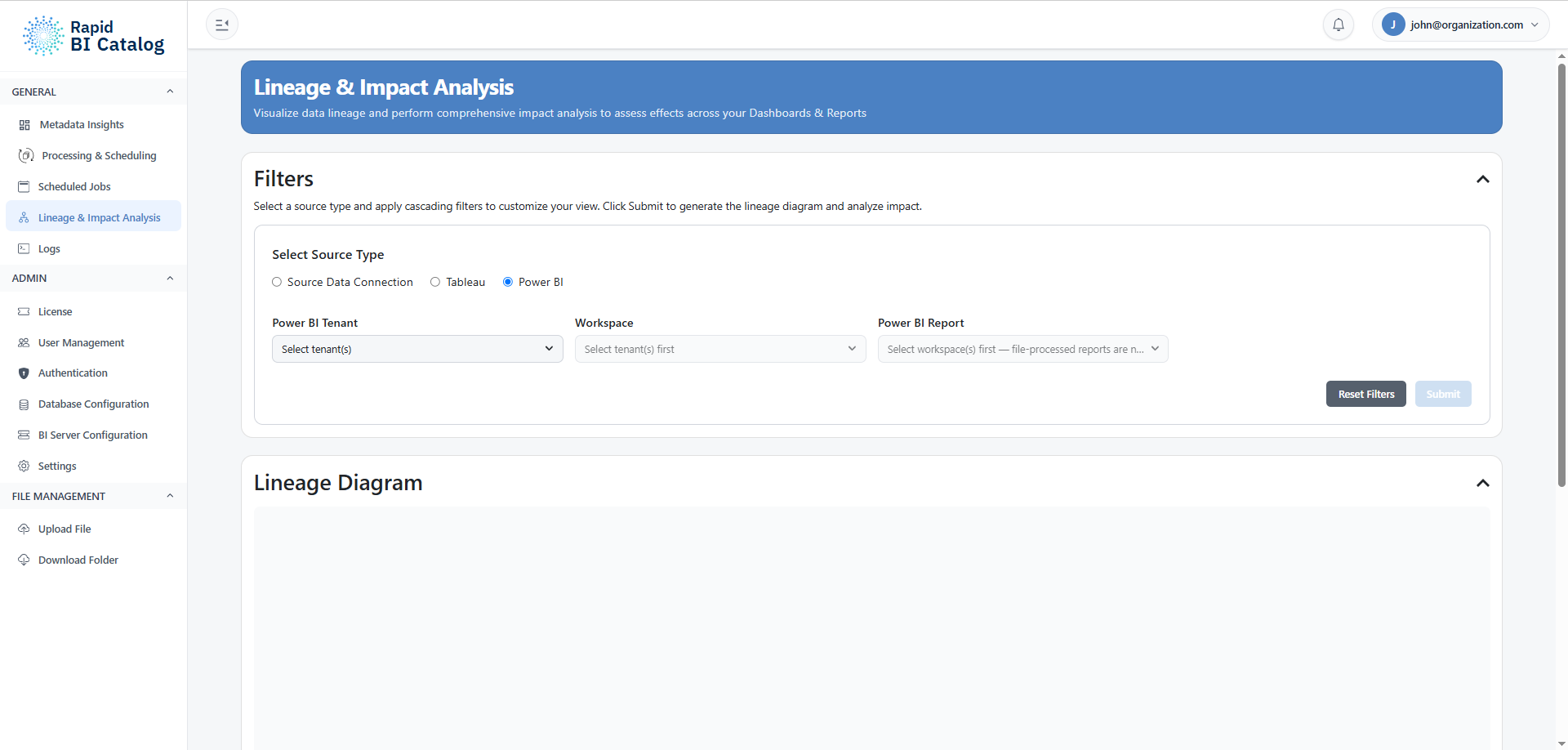
| Filter | Required | Notes |
|---|---|---|
| Power BI Tenant | Yes, to proceed | Select one or more configured Power BI environments |
| Workspace | Yes, to proceed | Activates after a tenant is selected |
| Power BI Report | ✅ Yes | Activates after a workspace is selected. Submit stays disabled until at least one report is chosen; Select all takes every report under the workspaces you chose. |
Step 3 — Submit or Reset
- Submit — Generates the Lineage Diagram and (in Data Connection mode) the Impact Analysis. Disabled until the minimum required filter is selected.
- Reset Filters — Clears all filter selections and resets the diagram and impact analysis. Disabled when no filters are applied.
Section 2: Impact Analysis (Source Data Connection Mode Only)
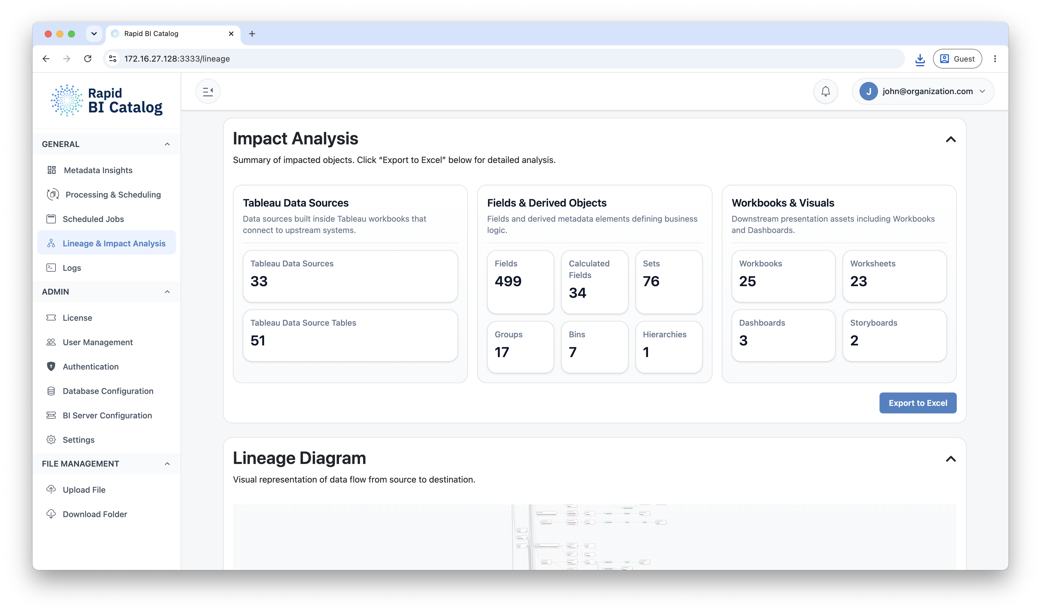
This section appears automatically when the Source Data Connection source type is selected. It provides a structured count of every object impacted by your selection, grouped into six categories — three for Tableau, three for Power BI.
| Category | What it counts |
|---|---|
| Tableau Data Sources | Tableau data sources and their tables |
| Fields & Derived Objects | Tableau fields, calculated fields, sets, groups, bins and hierarchies |
| Workbooks & Visuals | Tableau workbooks, worksheets, dashboards and storyboards |
| Semantic Models | The Power BI datasets that hold the model a report reads from |
| Model Fields & Derived Objects | Columns, measures and other model elements defining business logic |
| Reports & Visuals | Downstream presentation assets including Reports, Pages and Visuals |
Exporting Impact Analysis
An Export to Excel button is available at the bottom of this section. It downloads a timestamped .xlsx file with detailed impact analysis for offline review. The export button is disabled if no results are present.
Section 3: Lineage Diagram
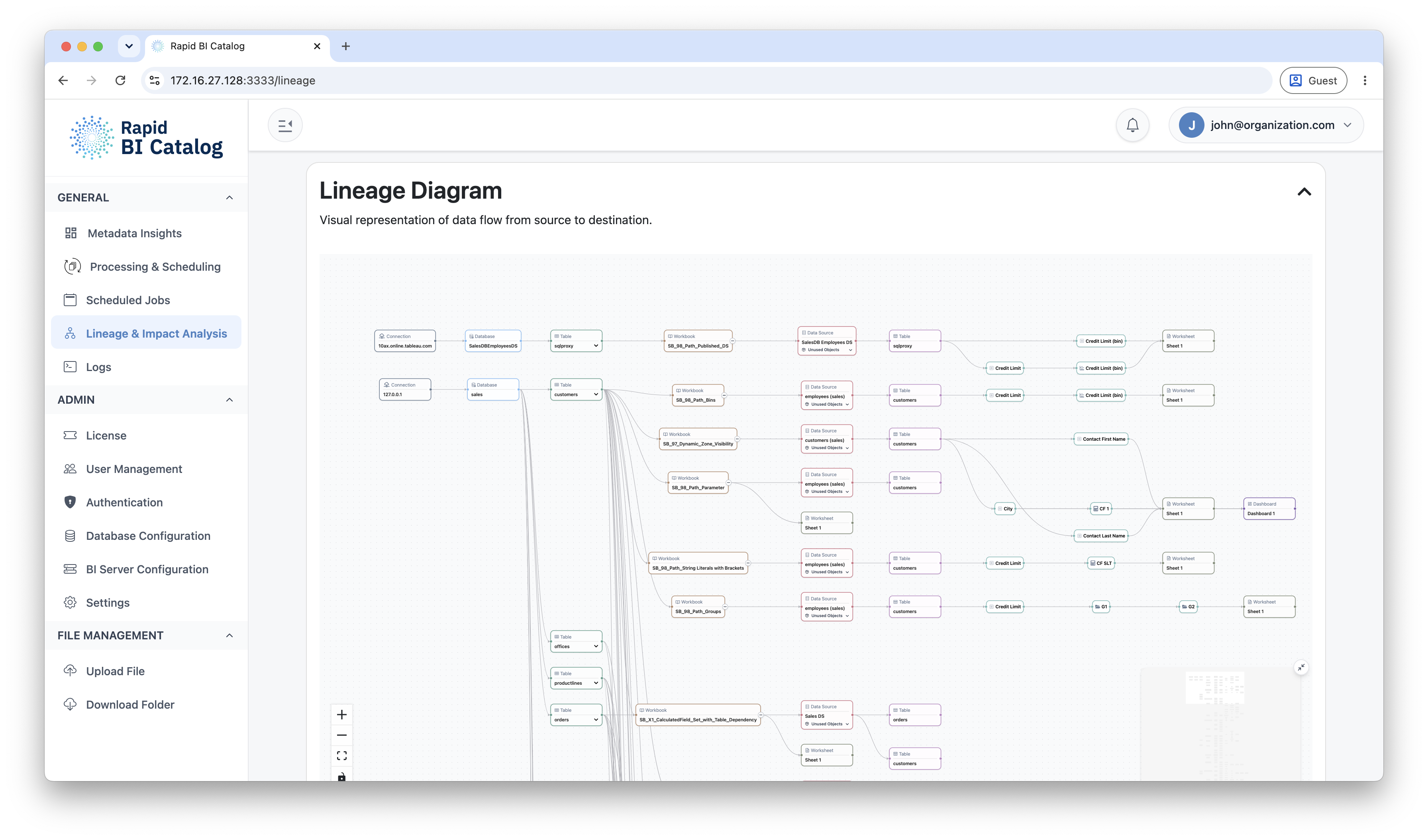
The Lineage Diagram is an interactive, node-based visualization of the data flow generated by your submitted filters.
The shared physical layer
Four node types are emitted by both tools and are the common ground between them: Connection, Database, Table and Physical Field. A warehouse table referenced by a Tableau workbook and by a Power BI report is one node, not two — which is why a single impact search spans both tools, and why the Impact Analysis section can count Tableau and Power BI objects against the same selection.
Node Types
Above the physical layer, each tool contributes its own node types.
| Level | Tableau node types |
|---|---|
| Data Level | Connection, Database, Table, Physical Field |
| Tableau Level | Data Source, Table, Field, Calculated Field, Set, Group, Bin, Hierarchy, Parameter |
| Visual Level | Workbook, Worksheet, Dashboard, Storyboard |
| Level | Power BI node types |
|---|---|
| Data Level | Connection, Database, Table, Physical Field |
| Model Level | Semantic Model, Model Table, Column, Calculated Column, Measure, Calculation Item, Hierarchy, M Parameter, Row-Level Role |
| Report Level | Report, Page, Visual, Bookmark |
Highlighting and Tracing
| Action | Result |
|---|---|
| Hover over a node | Highlights the node and all its directly connected nodes and edges. Non-connected nodes and edges become dimmed. |
| Click a node | Locks the highlight in place so it remains active when you move your mouse. Click the same node again to unlock it. Multiple nodes can be locked simultaneously. |
| Clear Highlights | A button below the diagram clears all active hover and locked highlights at once. |
Navigation Controls
| Control | Location | Function |
|---|---|---|
| Zoom In / Out / Fit | Bottom-left of the diagram | Standard zoom controls and reset-to-fit-view |
| Mini-Map | Bottom-right of the diagram | A thumbnail overview of the full diagram showing your current viewport. The mini-map itself is zoomable and pannable. |
| Mini-Map Toggle | Small button embedded in the diagram corner | Click to show or hide the mini-map |
Next Steps
- Understand the Excel export format: Impact Analysis Export (Excel)
- Explore metadata dashboards: Metadata Insights